User Experience Design + User Interface Design
Pinterest is a visual bookmarking tool that helps you discover, save, collect and share creative ideas and images. Users generally use it as an online mood board to keep their findings stored.
Objective
The focus of this graduate school project was to discover and resolve usability issues within the Pinterest mobile app. We were to conduct research using methods such as interviews, user testing and paper tests, among others, in order to design solutions.
My Role
• Conduct Competitive Analysis
• Evaluate Pinterest App Heuristics
• Conduct User Interviews
• Paper Testing
• Redesign App components
Other Team Members
Nia Gordon
Ana Davila
Kelly Lonergan
Research and Design Process
App Store Reviews
We wanted to gauge the surface of how people were feeling about the app. So, the first place we checked was the App Store. Usually, people have some interesting things to say when they feel compelled enough to leave reviews. We understood that most reviews lack the proper context, but we still wanted to be thorough in our research.
Competitive Analysis
It is always good practice to take a look at the market. We had questions about the competitors at the time. We chose to take a deeper look into three of them, which include: Instagram, Fancy and We Heart It. All three are social networking platforms that push the idea of curation on some level. They were all unique in their focus, but shared similar functions with Pinterest.
User Interviews & Analysis
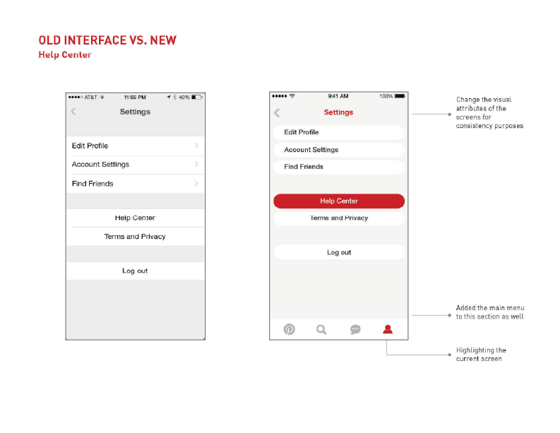
When we compiled our interview data, a few things became very clear. First, the icons were a big issue and because of this, locating specific items was not as intuitive. Users had a hard time with the Help Center fuction, as we suspected they would. Some were using the search function to actually search the phrase “help.” This didn’t solve anything because the results simply populated with pins about self-help, quotes about life and information about personal crisis. Another interesting thing we didn’t see coming was how users attempted shortcuts. When we asked them to complete certain tasks, we noticed that they were trying to use Apple shortcuts, which were not linked to the app in that way. Overall, it was a very informative experience.
More details about the interview questions and process are in the presentation book below.
User Personas
Perfect & Problem Scenarios
Scenarios and corresponding flowcharts were important in helping to figure out how users were really navigating Pinterest. While the “Perfect Scenarios” helped us see what Pinterest expected users to do, the “Problem Scenarios” showed a “normal” user’s actual experience. These insights went a long way in helping to develop the final solutions.
More details about the user personas and scenarios are in the presentation book below.
Paper Testing
Paper testing is one of the most useful tools we could have used throughout the entire process. It provided us with a quick, low-fidelity method of testing and reiterating.
Solutions
The redesign involved reorganizing some existing features and adding some new ones. The slides below show the old interface versus the redesign.
Click the button below to view a more detailed and comprehensive presentation.
Retrospective
In hindsight, I learned that a fully fleshed out UX/UI project can be very consuming and seem daunting. The majority of the more tedious work definitely happens in the research portion of the project. The insights from all of the interviews and testing led me to believe that there is no one size fits all solution within apps that push user creativity.
Also, big tech platforms like Pinterest, who have their own huge research & design teams, are likely already aware of a lot of user issues and have planned updates. A few months after the completion of this project, Pinterest had started rolling out some of the same solutions that we came up with.


